Getting Started with CSS Grid Layout
A beginner's guide to using CSS Grid for modern, responsive layouts.
Read More
John Doe
Web Developer & Designer

In today's mobile-first world, building responsive websites is not just a luxury but a necessity. Users access websites from various devices with different screen sizes, from smartphones to large desktop monitors. A responsive website adapts seamlessly to all these screen sizes, providing an optimal viewing experience.
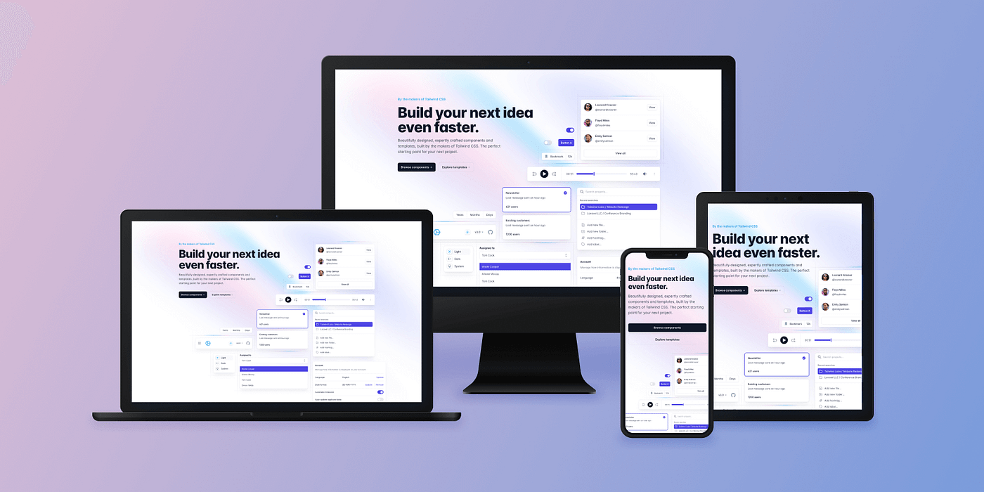
Tailwind CSS has emerged as one of the most popular utility-first CSS frameworks that makes building responsive websites faster and easier. In this comprehensive guide, we'll explore how to use Tailwind CSS to create a fully responsive website.
Tailwind CSS is a utility-first CSS framework that provides low-level utility classes to build custom designs without leaving your HTML. Unlike other CSS frameworks like Bootstrap or Foundation that come with predefined components, Tailwind gives you utility classes that you can combine to create your own unique designs.
"Tailwind CSS is the only framework that I've seen scale on large teams. It's easy to customize, adapts to any design, and the build size is tiny." - Adam Wathan, Creator of Tailwind CSS
Before we dive into building a responsive website, let's set up Tailwind CSS in our project. There are several ways to install Tailwind, but we'll focus on the most straightforward approach using the CDN.
The quickest way to start using Tailwind is through the CDN. Add this line to the <head> section of your HTML:
<script src="https://cdn.tailwindcss.com"></script>While this method is perfect for learning and small projects, for production websites, it's recommended to install Tailwind via npm and use a build process to optimize the CSS.
For a more customizable setup, you can install Tailwind using npm:
npm install -D tailwindcss
npx tailwindcss init
This creates a tailwind.config.js file where you can customize your Tailwind installation.
Tailwind makes responsive design incredibly intuitive by using responsive modifiers that target specific breakpoints. The default breakpoints in Tailwind are:
To apply a utility at a specific breakpoint, prefix the utility with the breakpoint name followed by a colon:
<div class="w-full md:w-1/2 lg:w-1/3">
    This div is full width on mobile, half width on medium screens, and one-third width on large screens.
</div>
Tailwind follows a mobile-first approach. This means unprefixed utilities (like w-full) apply to all screen sizes, while prefixed utilities (like md:w-1/2) apply only at the specified breakpoint and above.
Let's look at a practical example of a responsive navigation bar:
<nav class="flex flex-col md:flex-row justify-between items-center p-4">
    <div class="logo mb-4 md:mb-0">
        <img src="logo.png" alt="Logo">
    </div>
    <ul class="flex flex-col md:flex-row space-y-2 md:space-y-0 md:space-x-6">
        <li><a href="#">Home</a></li>
        <li><a href="#">About</a></li>
        <li><a href="#">Services</a></li>
        <li><a href="#">Contact</a></li>
    </ul>
</nav>
In this example, the navigation is a column on mobile devices and becomes a row on medium screens and up. The logo has a bottom margin on mobile that disappears on medium screens. The navigation links are stacked vertically on mobile with vertical spacing and become horizontal with horizontal spacing on medium screens.
Let's build a responsive layout for a simple website with a header, main content with a sidebar, and a footer.
<div class="min-h-screen flex flex-col">
    <!-- Header -->
    <header class="bg-indigo-600 text-white p-4">
        <div class="container mx-auto">
            <h1 class="text-2xl font-bold">My Website</h1>
        </div>
    </header>

    <!-- Main Content -->
    <div class="flex-grow">
        <div class="container mx-auto p-4 flex flex-col lg:flex-row">
            <!-- Main Content -->
            <main class="w-full lg:w-3/4 lg:pr-8">
                <h2 class="text-xl font-semibold mb-4">Main Content</h2>
                <p>Lorem ipsum dolor sit amet...</p>
            </main>

            <!-- Sidebar -->
            <aside class="w-full lg:w-1/4 mt-8 lg:mt-0">
                <div class="bg-gray-100 p-4 rounded">
                    <h2 class="text-xl font-semibold mb-4">Sidebar</h2>
                    <p>Sidebar content goes here.</p>
                </div>
            </aside>
        </div>
    </div>

    <!-- Footer -->
    <footer class="bg-gray-800 text-white p-4">
        <div class="container mx-auto">
            <p>© 2025 My Website. All rights reserved.</p>
        </div>
    </footer>
</div>
In this layout, the main content and sidebar stack vertically on mobile and small screens, then become a horizontal layout on large screens (1024px and up). The main content takes up 75% of the width, and the sidebar takes up 25% on large screens.
Tailwind CSS provides a powerful and intuitive way to build responsive websites. By using its responsive modifiers, you can create layouts that adapt seamlessly to different screen sizes without writing custom media queries.
Remember, the key to successful responsive design is thinking about how your content should adapt to different screen sizes and using the appropriate Tailwind utilities to achieve that vision.
Start with mobile designs, test thoroughly, and leverage Tailwind's extensive utility classes to create beautiful, responsive websites that provide an excellent user experience on any device.

A beginner's guide to using CSS Grid for modern, responsive layouts.
Read More
Techniques and best practices to improve your website's loading speed and performance.
Read More
Comparing popular JavaScript frameworks and how to choose the right one for your project.
Read More
Great article! I've been using Tailwind for a few months now and it's completely changed how I approach CSS. The utility-first approach is so much more efficient.

Thanks, Sarah! I'm glad you found it helpful. Tailwind has definitely improved my workflow too.

I've been hesitant to try Tailwind because I was worried about having too many classes in my HTML. But your article convinced me to give it a shot. The responsive modifiers look particularly useful!

Do you have any recommendations for optimizing Tailwind for production? I'm concerned about the file size for larger projects.